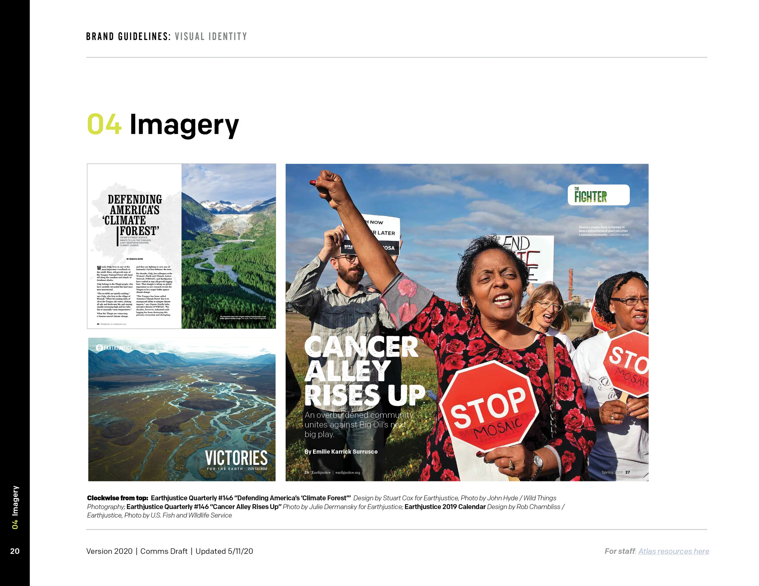
Earthjustice Brand Guide
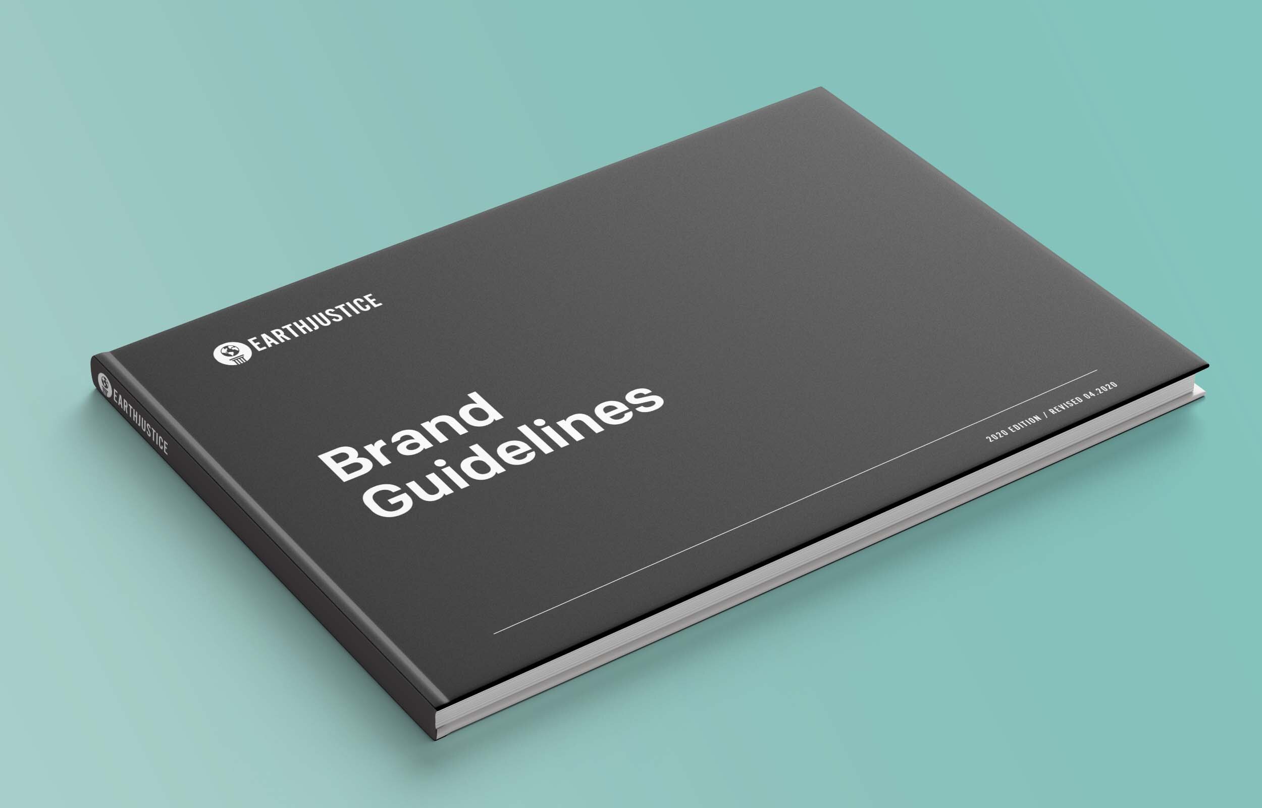
When I was hired at Earthjustice, I was assigned to overhaul our current Brand Book and re-design it. As an environmental law organization, it was challenging to portray every aspect of our brand in an accessible format, while also addressing the importance of our ethical practices around photography and sustainability.
Research + Implementation
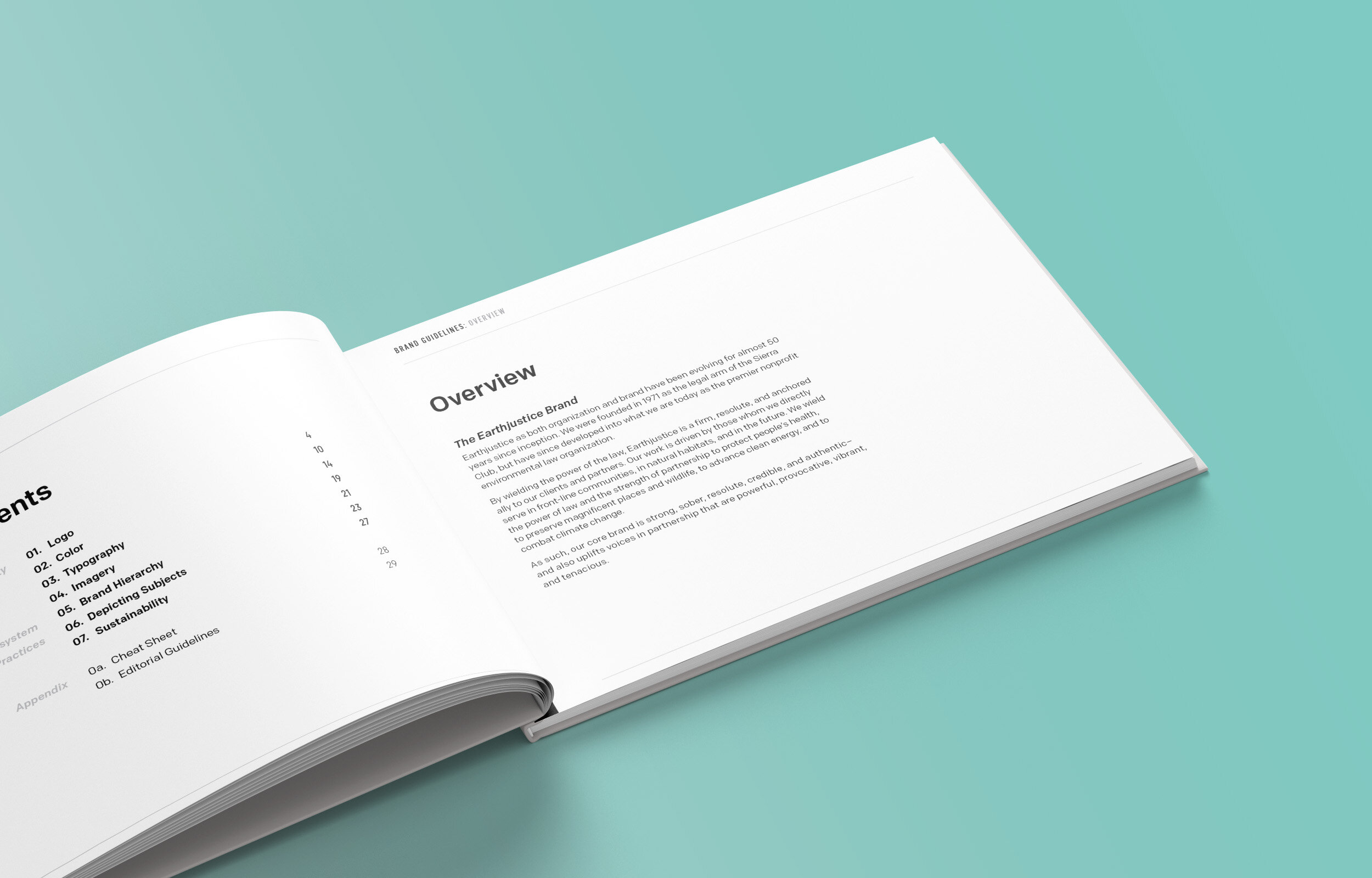
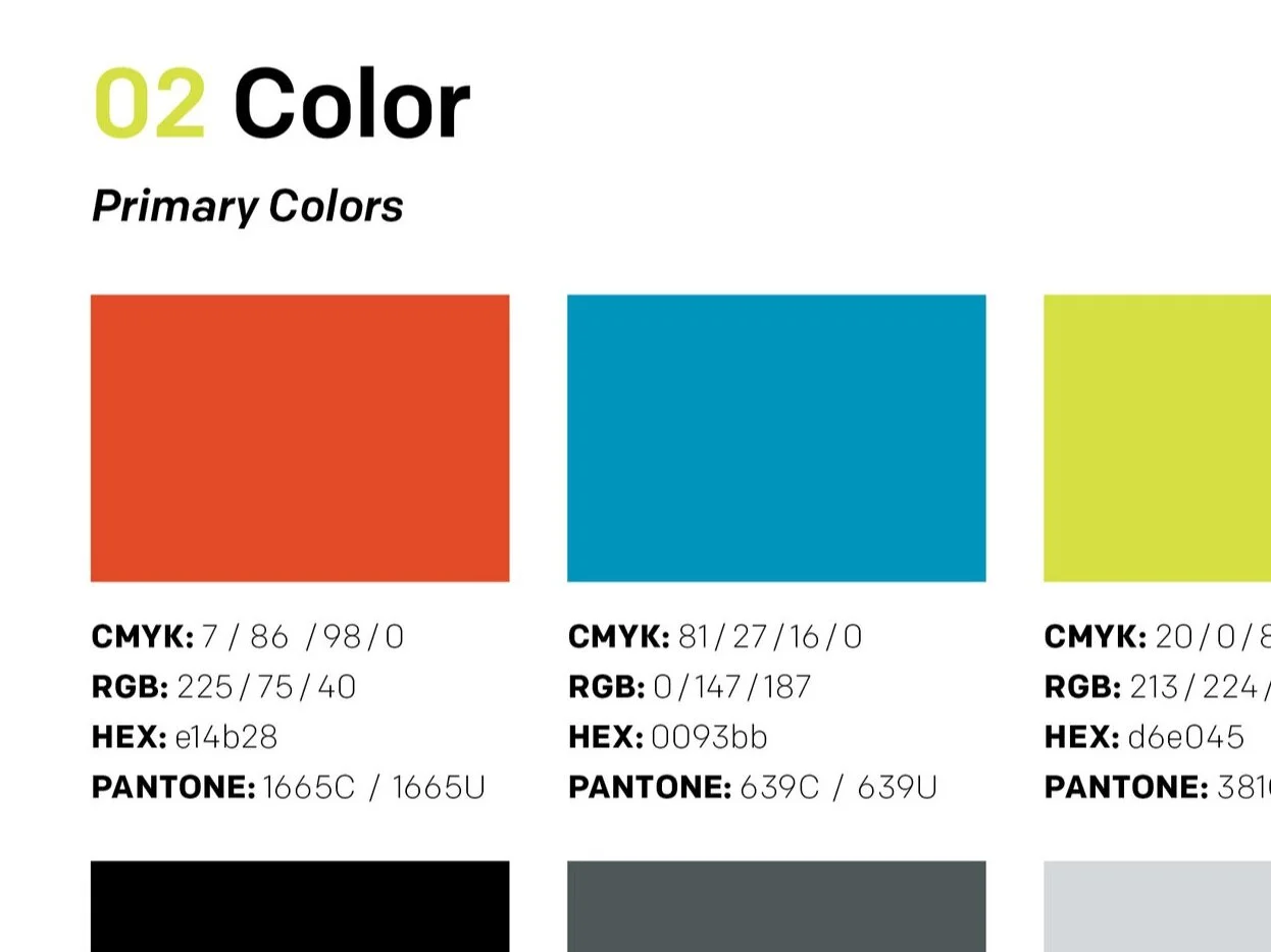
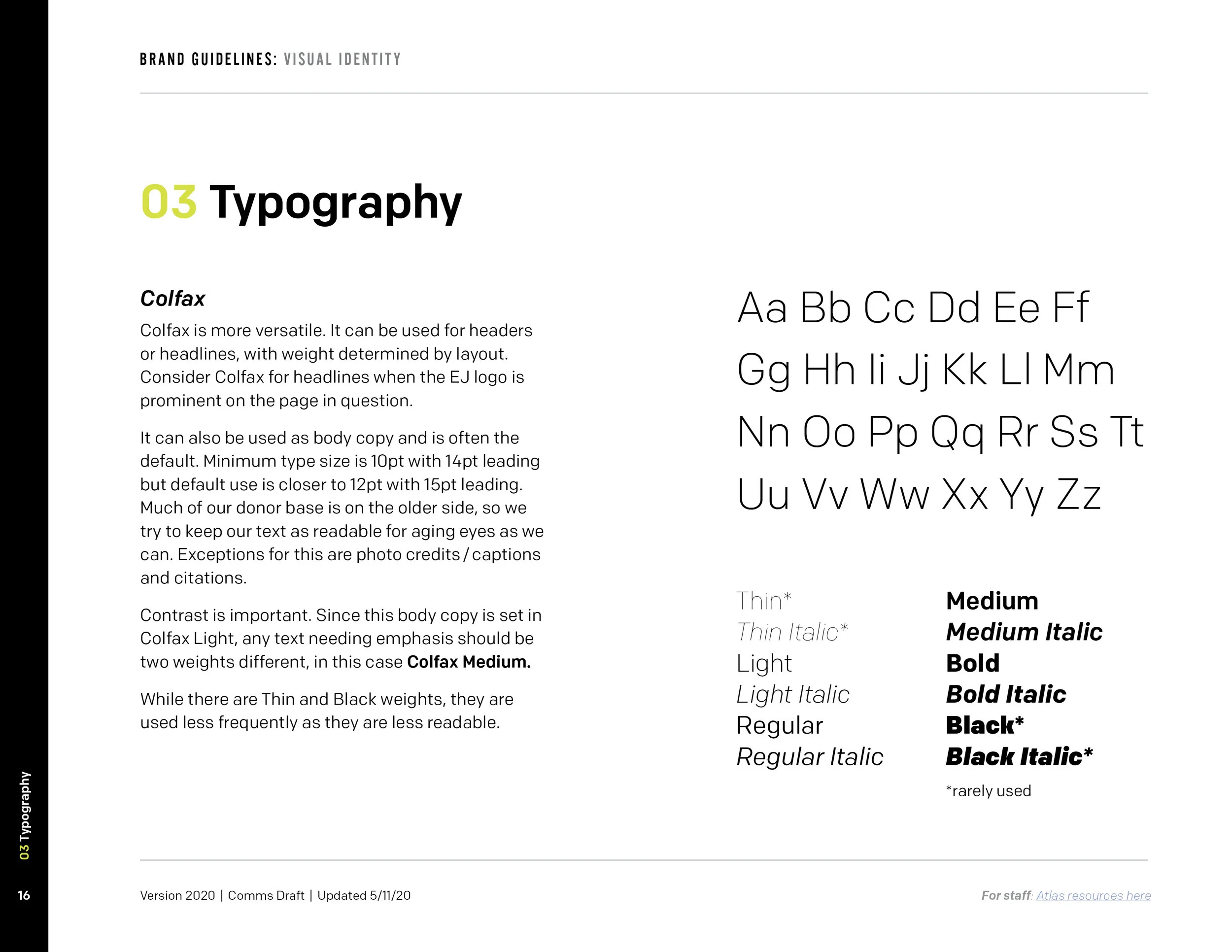
Half the challenge in designing our guidelines was figuring out (1) the hierarchy of information and (2) how to use our existing assets (fonts, colors, logos) and present them in a more exciting way. I wanted to ensure this guide provided detailed guidance for both internal partners and external design contractors.
For this project, I researched style guides from dozens of different peer organizations and nonprofits. I created a detailed outline that organized all the buckets of content we needed to cover. I leaned into simplicity, highlighting only the most critical information.
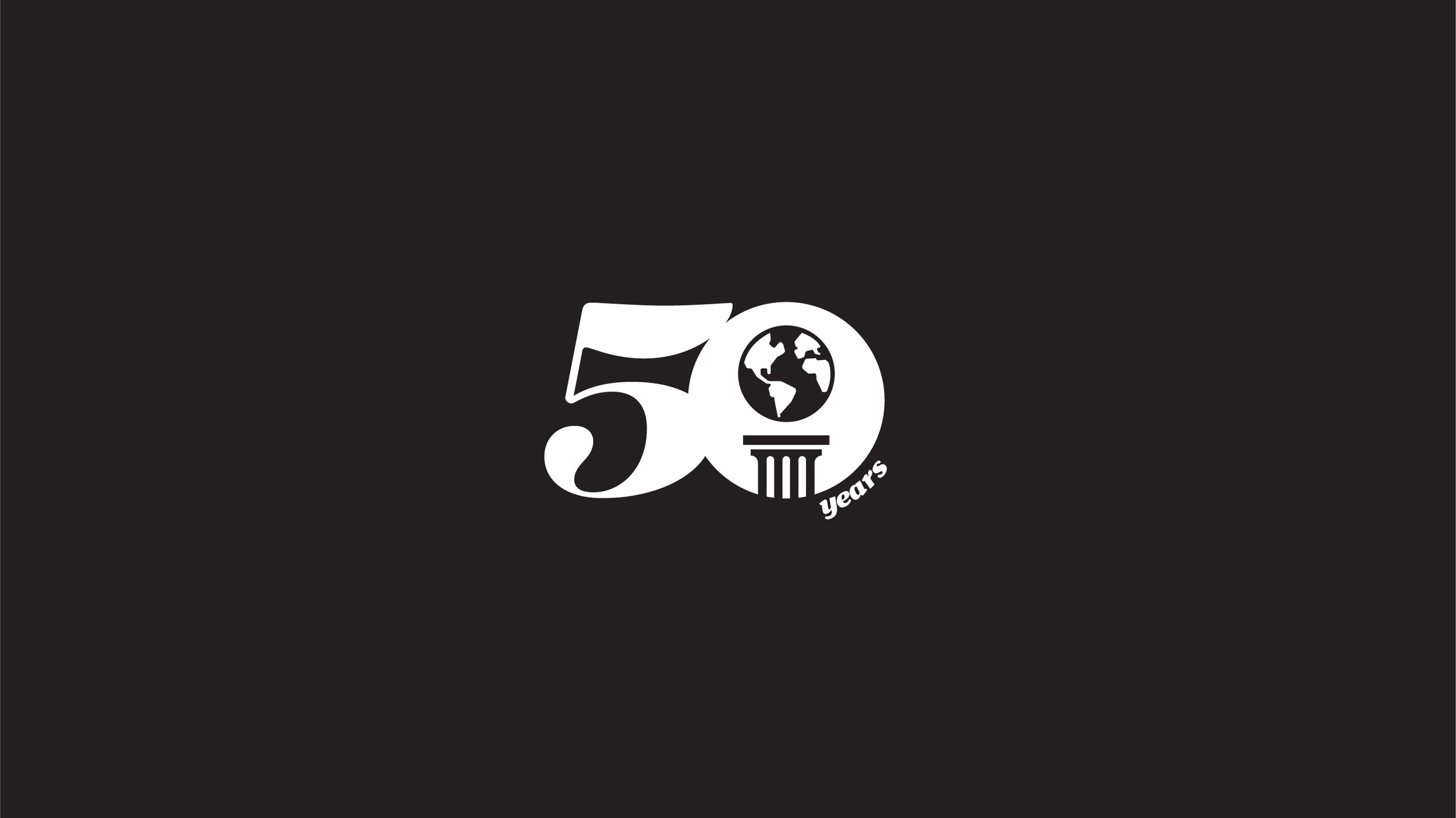
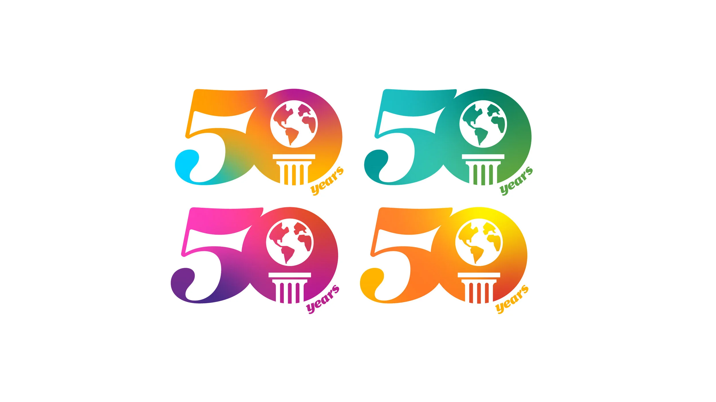
Earthjustice 50
Earthjustice celebrated its 50th anniversary in August 2021. For 50 years, we’ve been fighting for the planet and its people. This campaign marks our continued determination to work towards a thriving, equitable, and climate-resilient world—a future worth fighting for. For this campaign, I designed the logo, provided art direction, and coordinated social media content.
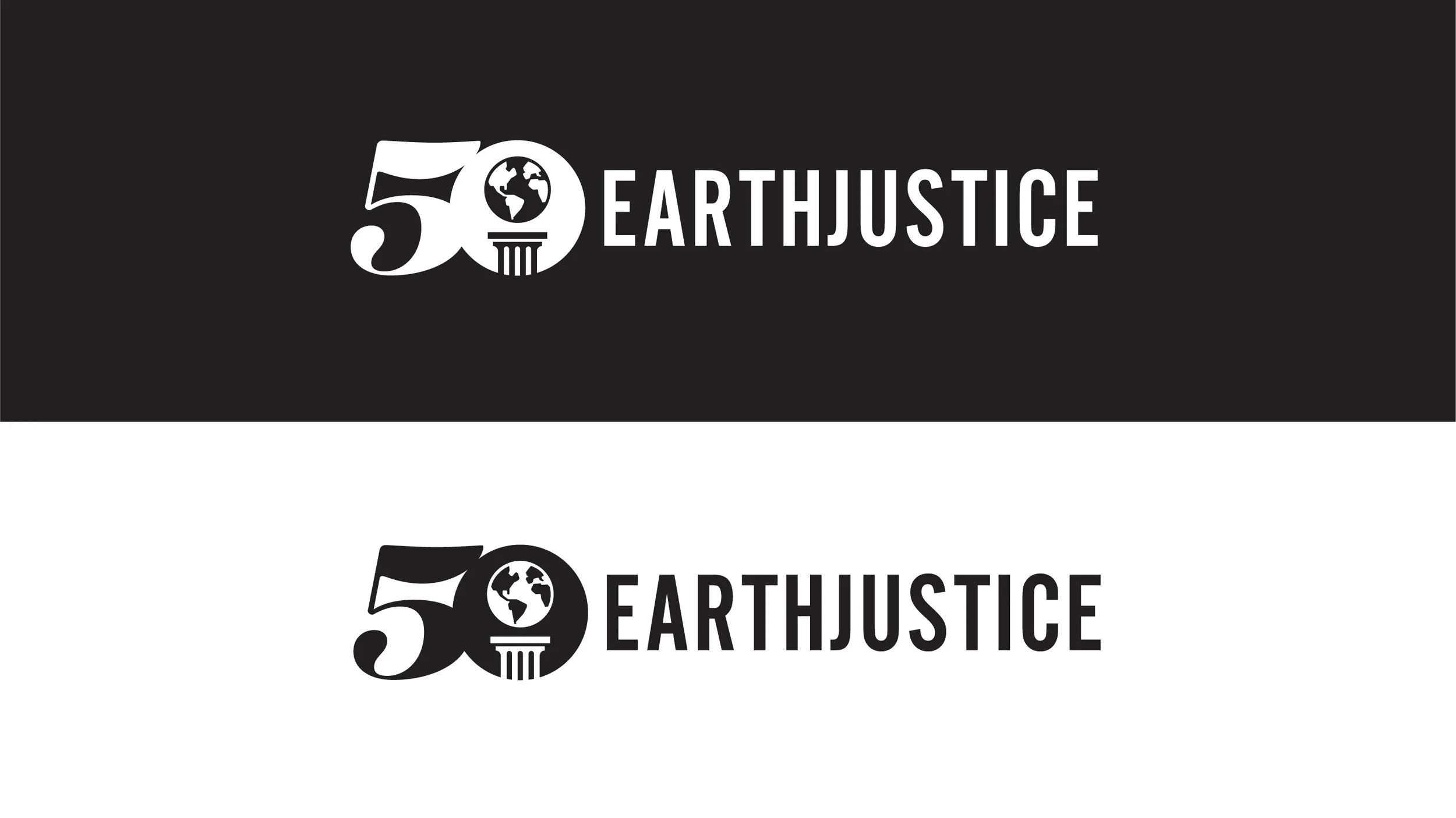
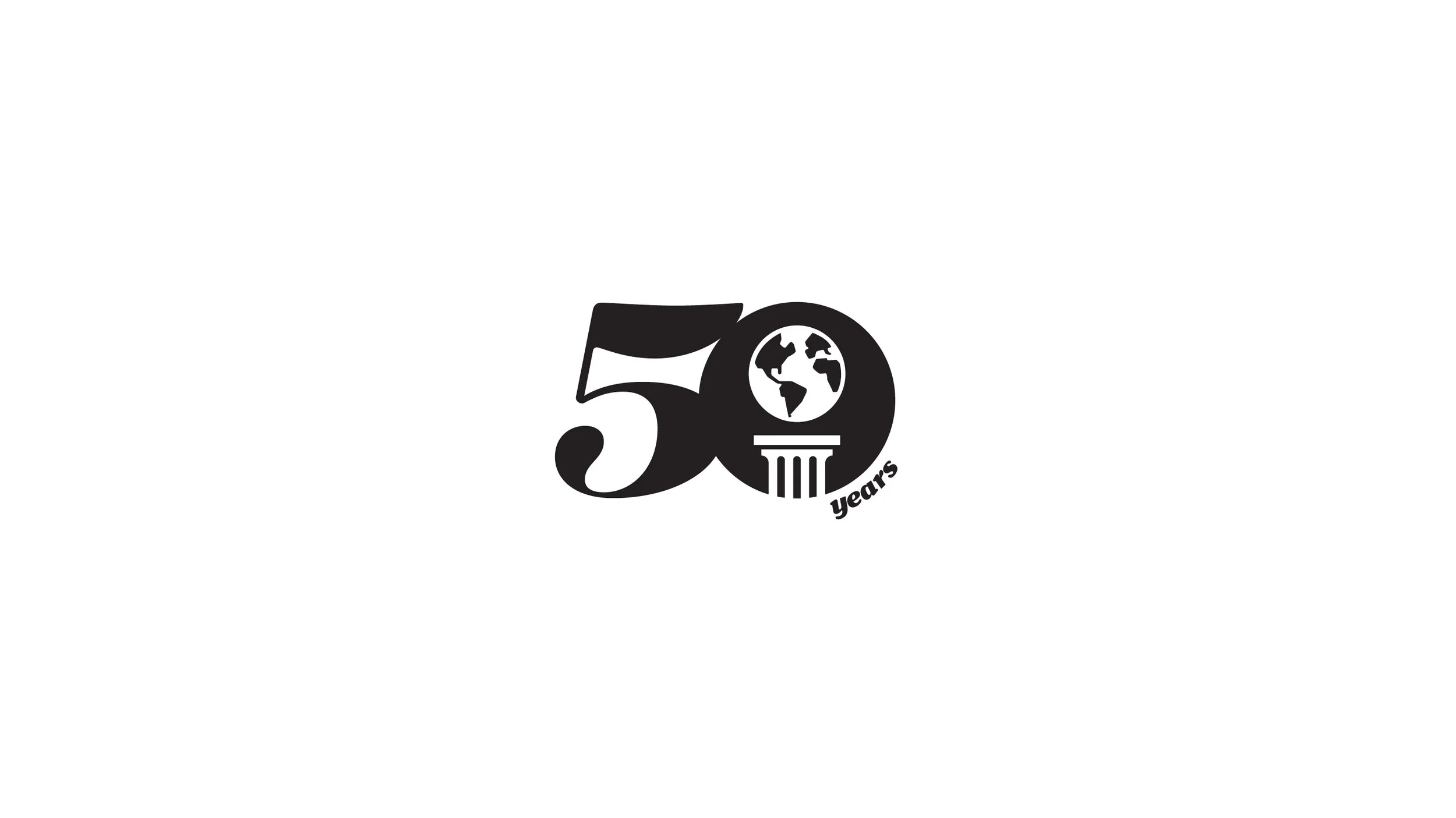
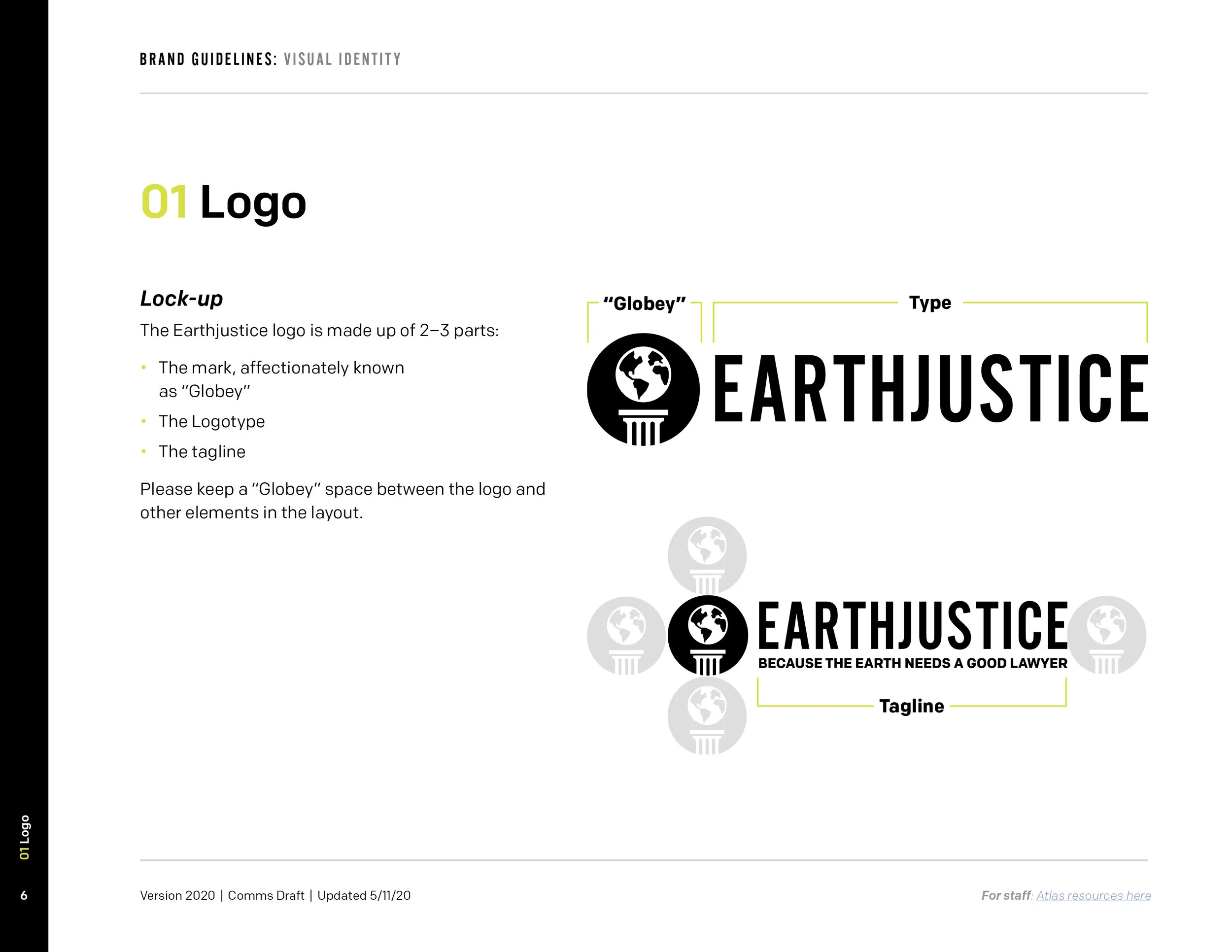
Logo Design
Our primary goal, as a creative team, was to create a universal logotype utilized by the entire organization. Because Earthjustice came about during the ’70s, it was our intention to design a logo that was both vibrant and celebratory—while also, keeping it true to our history as an organization and law firm.
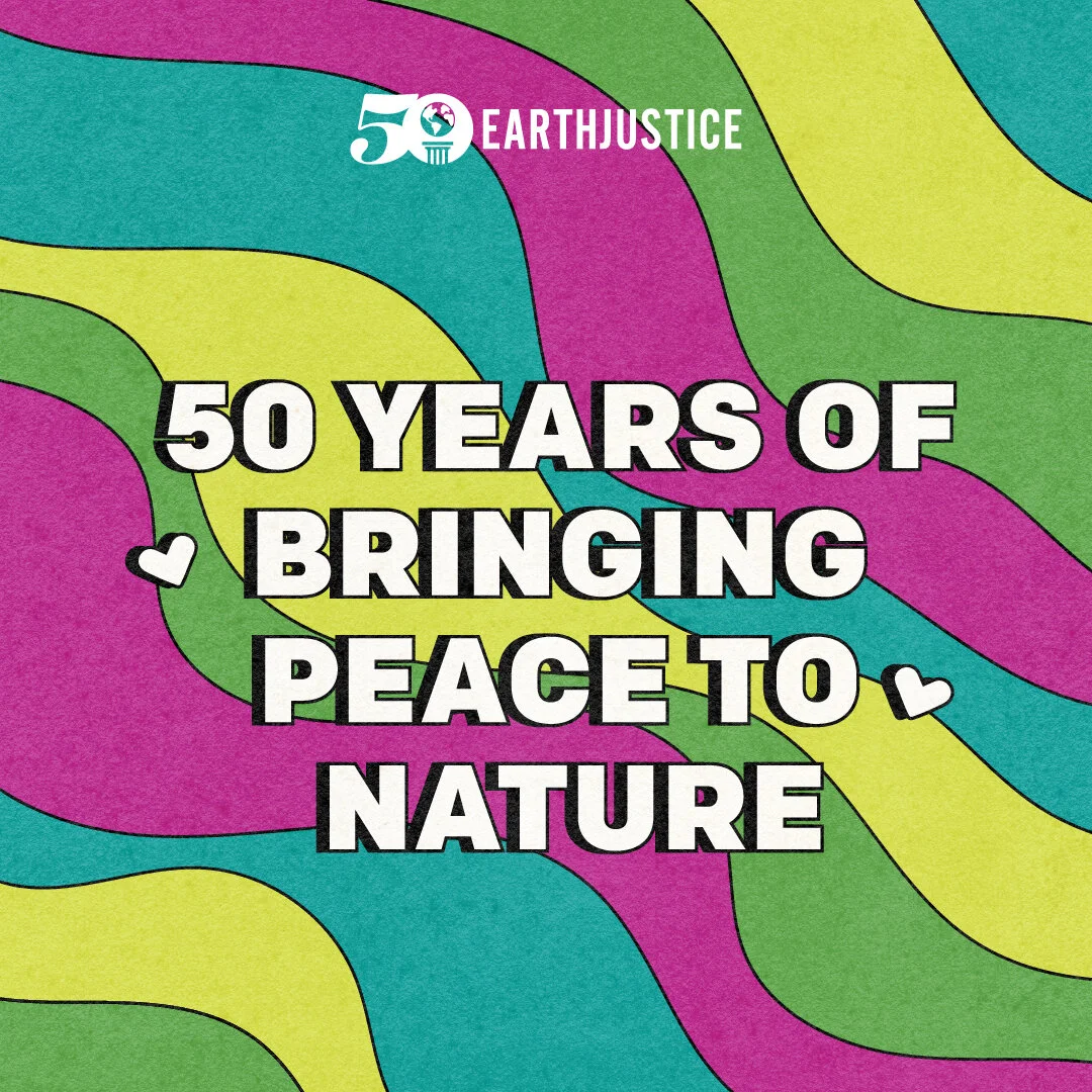
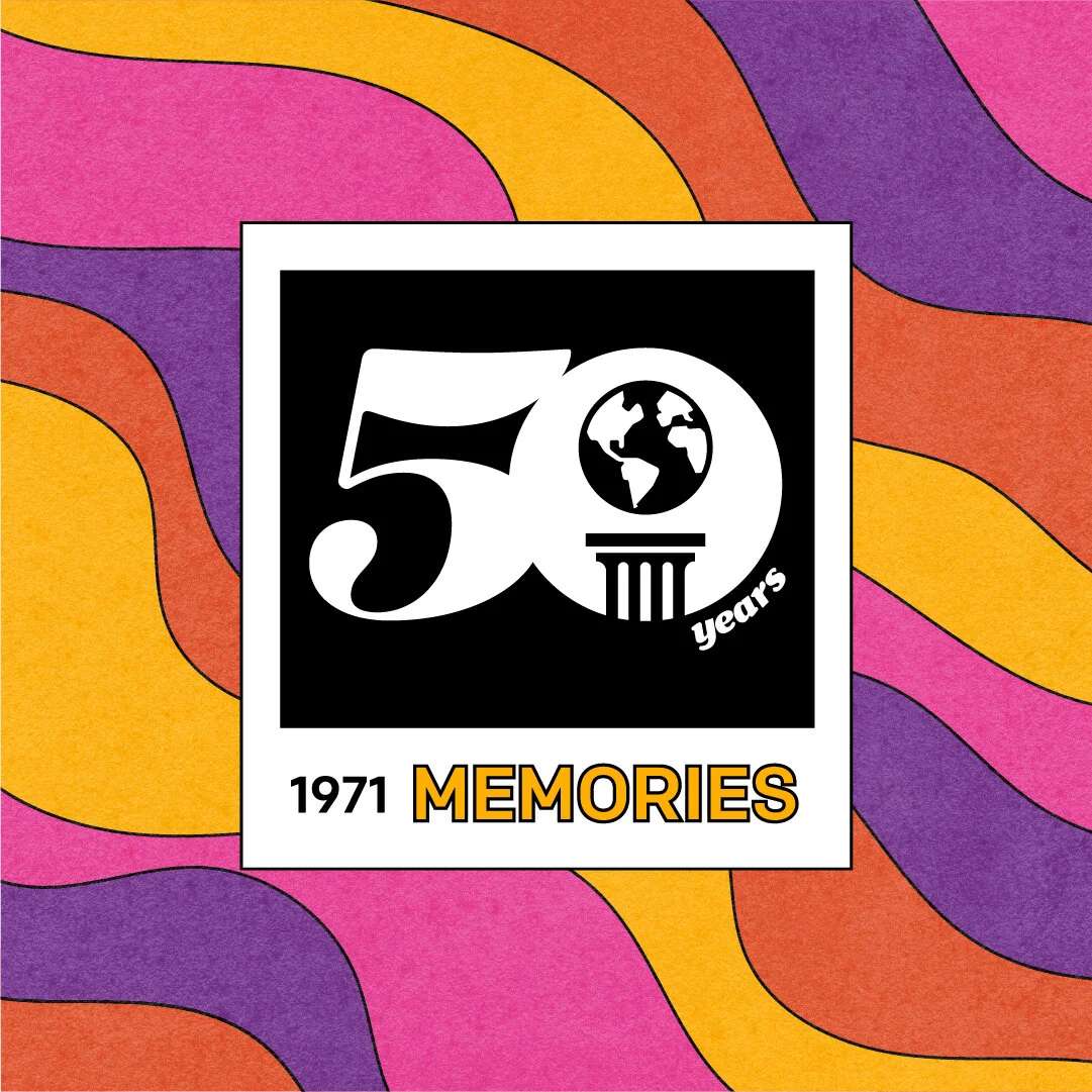
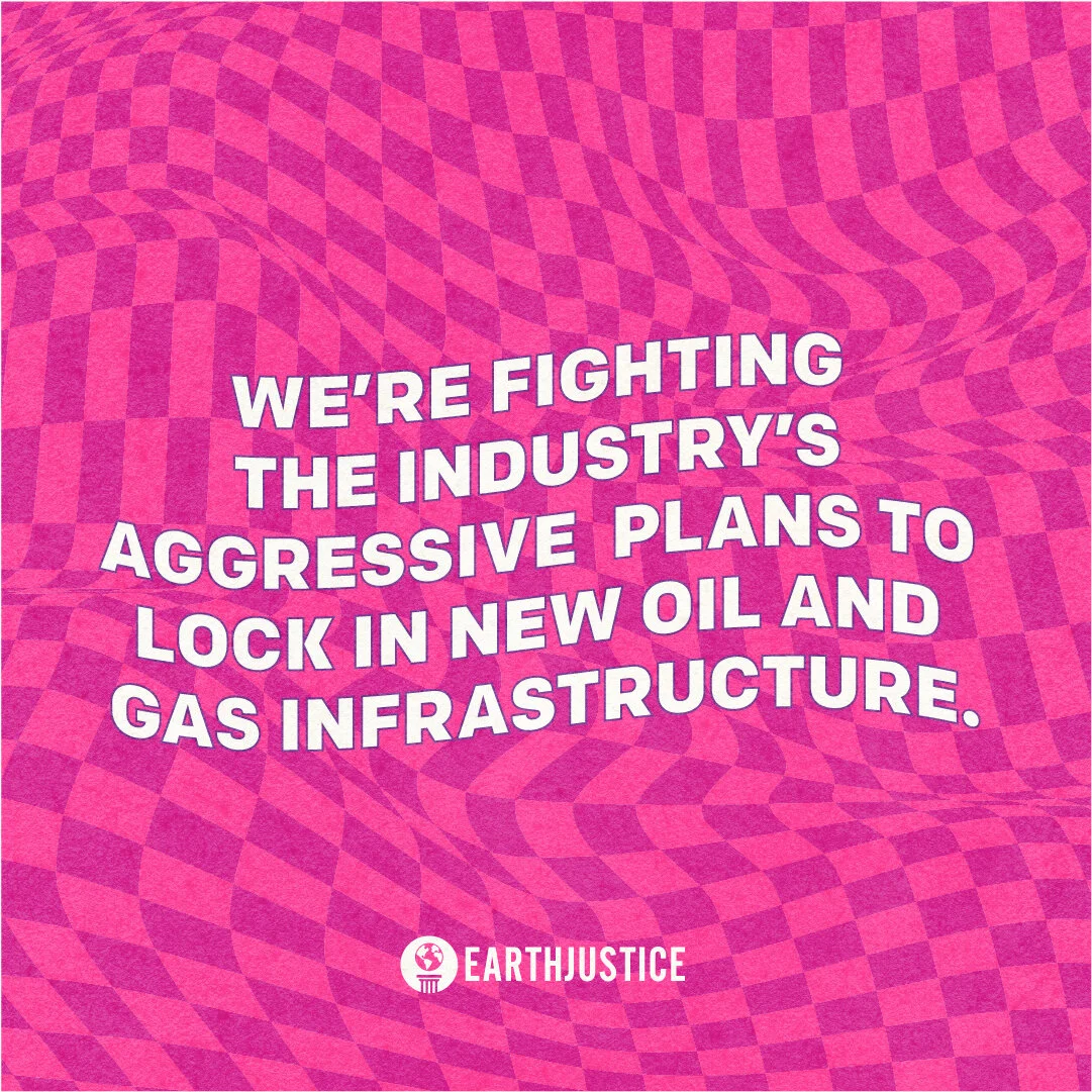
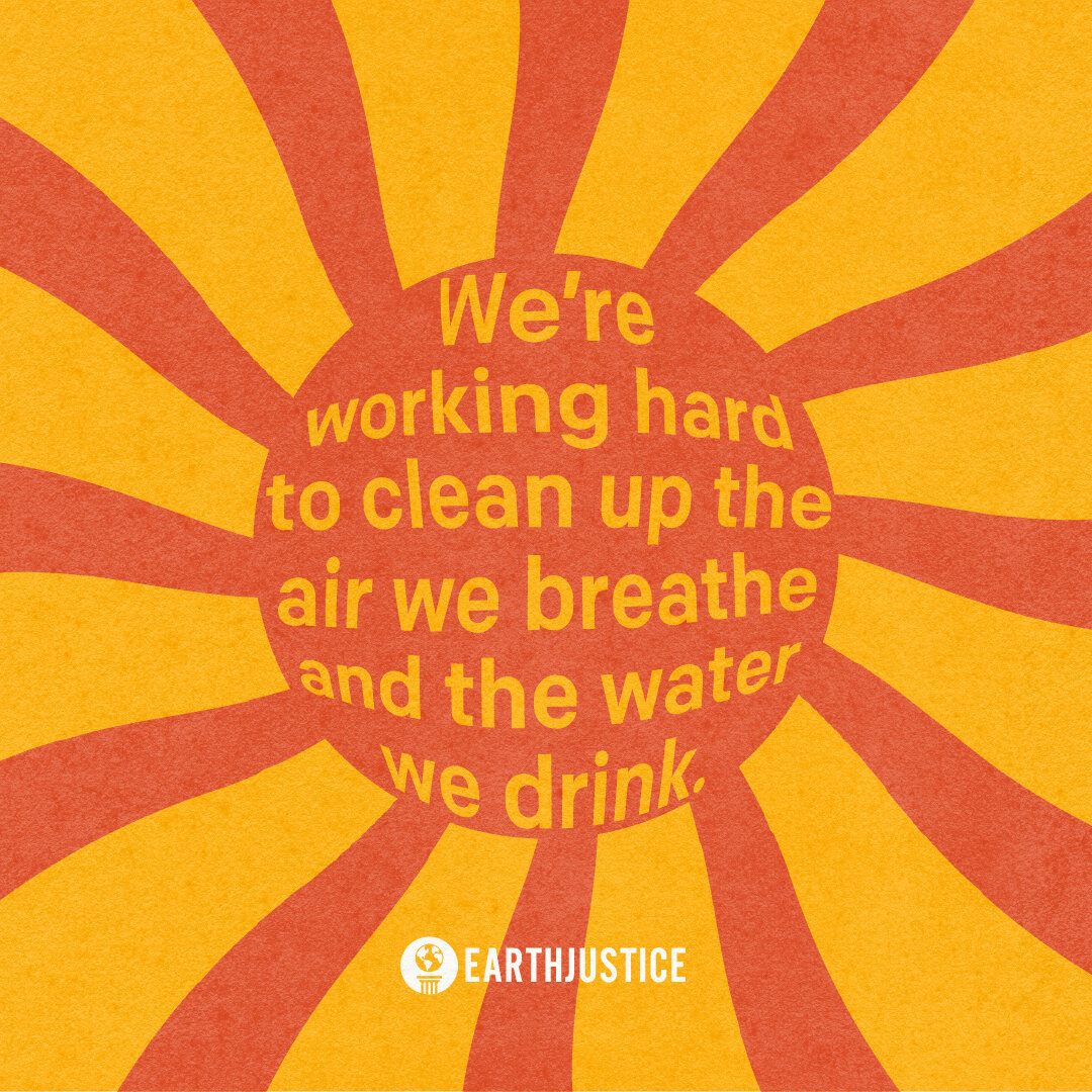
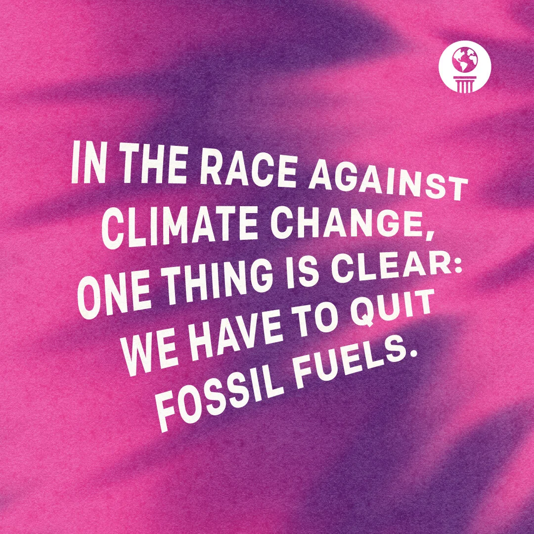
Social Media Campaign
Our social platforms have experienced a considerable amount of growth over the last couple of years. To take advantage of our pool of new followers, we wanted to create a campaign specific to social media in order to engage and reach a younger, more diverse audience.
As the Design Lead for this project, I took on a greater Art Direction role and worked with external contractors in coming up with the designs. Due to the nature and current trends on social media, we had lots of room to experiment with color, typography, and style. We pulled in lots of ‘70s design characteristics, with the vibrant colors, wavy lines, and patterns. I wanted these to make an impact on our followers and compel them to share out on their own platform